• Discover new ways to elevate your game with the updated DGCourseReview app!
    It's entirely free and enhanced with features shaped by user feedback to ensure your best experience on the course. (App Store or Google Play)
FRD-New logo thought

dgdave

* Ace Member *
Joined
Jan 15, 2007
Messages
13,138
Location
Norman, Ok
Be honest

FRDNewAddycopy.jpg
 
eh... I like the font but not the two colors... maybe throw in some new colors.. not a fan of the wire frame design either - but just my .02
 
If you haven't done so yet, you should ask yourself, "Why should people choose FRD over dynamic discs?" or "What do we do that they don't and what do we do better?"

That said, I think your sample dyes are original, professional and just plain cool looking!

I like this logo:
shirt.png
 
Last edited:
I like the font and colors. I missed the spelled out "First Run Designs" first time I looked at it, so there probably needs to be some contrast between the letters and design... as for the design, it looks good, but it looks like a basketball net to me, and hence makes me think of basketball, not DG. Any way you could change the pattern to look like an overhead shot of what the chains would look like? That would definitely make me think DG.
 
I like your designs, the only problem I have is that it's not DG specific enough for me. Its understandable if you're venturing your brand towards different directions as well, but for DG-centric things I'd personally like something more recognizable as being related to the sport.
 
I did it in some different colors too. I added more shadow to seperate the text

FRDNewBLWcopy.jpg


Stormtrooper edition

FRDNewBWcopy.jpg
 
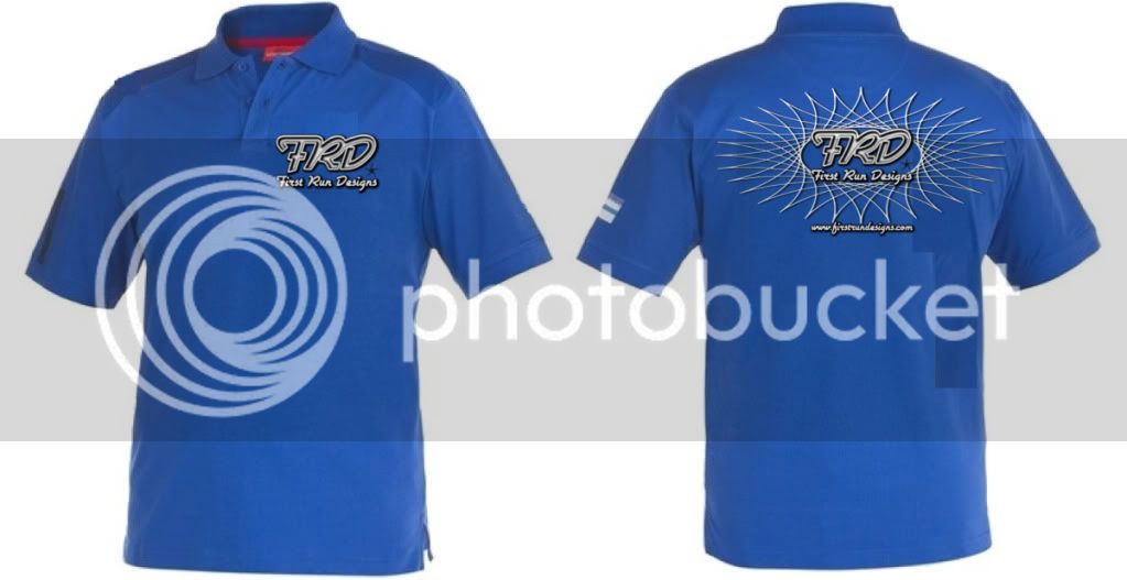
That jacket looks sick. The logo definately looks better on something rather than just plain. Id wear that jacket for sure though
 
maybe instead of the wire matrix look, consider wrapping FRD in chains somehow??
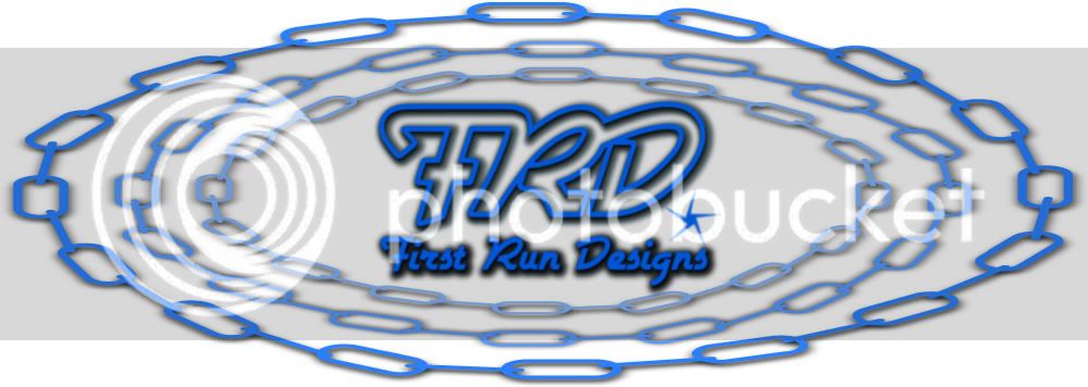
 
maybe instead of the wire matrix look, consider wrapping FRD in chains somehow??

this, the wire matrix seems dated to me, your avatar is for more contemporary. I do like the logo better than the star inside the spiral.

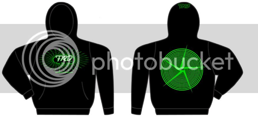
I think it looks much nicer on the back of the shirt than the front. I would wear the blue polo, but not the black sweater.
 
I do have some chains, but don't know how I feel about them. I was going for a pin stripe look. I love striping on hot rods and bikes.
 
could you stretch the wire frame out a little to make it more circular
that may give a stronger suggestion to a disc and the top of a basket looking down

but maybe that obvious connection is too hackneyed
 
I'll agree that the wireframe is dated. I actually think this logo is kinda stuck in the eighties, which doesn't appeal to me personally.

What might help is more synergy (as some have suggested) between either the logo and the product, or the name and the logo.

Or you could modify the business plan to sell only eighties-themed dg gear lol :D
 

Latest posts

Top