• Discover new ways to elevate your game with the updated DGCourseReview app!
    It's entirely free and enhanced with features shaped by user feedback to ensure your best experience on the course. (App Store or Google Play)

Skyiron Disc Golf

Graphics - I am uninterested in putting pictures of animals and cartoons on my discs. Graphics are cheap/easy to design and just as easy to change on future runs if I see fit.

Thanks for coming in and answering questions. I don't think any of us are suggesting that the disc needs cartoons or pictures to make it look legitimate. Perhaps just a more professional minimized look. Compare wham-o discs (which are universally disliked) and their look to Lat. 64, or Discmania Plain stamped discs. There is a large difference and there seem to be common denominators between successful designs.
 
wow those graphics are AWFUL!!! reminds me of the horrible Wham-O stamps. if thats what passes for quality from them i can understand why there is no hype. im predicting a huge FAIL for them. too sad. plus if you look at the pictures of the disc on the site, it looks like theres all sorts of flaws along the rim edge. although that may just be the picture.


I think the stamp is very contemporary. Looks good to me.

Blue_Spin_1.gif
 
The stamp reminds me of a free frisbee (or other nick-knack) that you'd get at some random seminar.
 
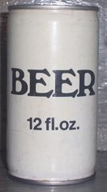
The flagship lettering is pure 80's generic
It should just say "Golf Disc" and nothing else
generic-beer.jpg
 
This thread...hell this site is so full of respectful and successful business men...any1 have a doller?

Best of luck man, do you best to get your stuff into local stores, that will be key.
 
I might buy one just for his comment on not wanting cartoon characters on his disc. That's a great line. Although I have no business throwing an 11 speed disc.
 
I am guessing they left the bottom somewhat rougher on purpose for grip.
Honestly not a bad idea.

^^This is what I was thinking as well after looking at the pictures.

I also think the top half of the stamp looks good with the Skyiron logo. I'm not too crazy about the bottom half, but that would not prevent me from throwing it and/or purchasing the disc if I had the opportunity.

Good luck Skyiron Disc Golf! :hfive:
 
I agree with you jason. The top half looks great, it's the bottom half that looks a little odd. The font looks unprofessional or something, I can't quite put words to it.
 
I agree with you jason. The top half looks great, it's the bottom half that looks a little odd. The font looks unprofessional or something, I can't quite put words to it.

My thoughts also. Anyone gonna buy one of these and see what's up? I would but I'm trying to keep it speed 7 and under.

And Skyrim bro, you seem like a cool guy. Definitely looking to see more from you in the future.
 
The tooling is mostly an aesthetic choice. It slightly improves grip because it is an "imperfection" at the disc surface. The disc doesn't feel rough, if you closed your eyes and held the disc you would not be able to tell which direction the tooling runs, or even notice it is there. It's not high-grit sandpaper, the disc feels as smooth as any other.

Do the discs take dye well and is the stamp relatively easy to remove? I would order one just to try if I thought I would be able to dye it.
 
I agree with you jason. The top half looks great, it's the bottom half that looks a little odd. The font looks unprofessional or something, I can't quite put words to it.

Occasionally when more than 1 font is used for anything, it just looks....strange to me.

Again, this will not prevent me from purchasing or throwing the disc or anything else from a new manufacturer.
 
I appreciate all the feedback (even the negative stuff). I'm starting to work with local retailers and build the brand. I seem to have underestimated the importance of the stamp! I think I'll make a change when I do another run. :doh:

I'm interested in sending a few discs out to prominent members of this site so they can give the disc a review for the masses. E-mail me at [email protected] with your PDGA # and we'll talk!
 
I am all for this feller succeeding.
Whether you care to admit it or not, the appearance matters to many consumers. I don't care about it that much, if a disc works, I'm in.

However: ignoring appearance solely because you personally prefer it to look plain, professional and utilitarian is a perfect recipe for lower sales. This does not mean you have to put a flaming rocket powered platypus on it...just something that catches the eye better than newsprint font. Someone brought up the Lat 64 and plain Discmania stamps earlier; those are the best around imo
 
Last edited:
I appreciate all the feedback (even the negative stuff). I'm starting to work with local retailers and build the brand. I seem to have underestimated the importance of the stamp! I think I'll make a change when I do another run. :doh:

I'm interested in sending a few discs out to prominent members of this site so they can give the disc a review for the masses. E-mail me at [email protected] with your PDGA # and we'll talk!

Don't get me wrong. I'm interested. While I like shiny purdy plastic, some of my best discs look like something you'd pick up at last call.
 
I am all for this feller succeeding.
Whether you care to admit it or not, the appearance matters to many consumers. I don't care about it that much, if a disc works, I'm in.

However: ignoring appearance solely because you personally prefer it to look plain, professional and utilitarian is a perfect recipe for lower sales. This does not mean you have to put a flaming rocket powered platypus on it...just something that catches the eye better than newsprint font. Someone brought up the Lat 64 and plain Discmania stamps earlier; those are the best around imo

The flaming rocket powered platypus sounds pretty amazing. I may need to try and dye that on a disc.
 
Top