regularjoe
Newbie
That's an easy $37 value added in my book."man this looks good but if they had just screen printed some random looking image all over it I'd be much happier"
Discover new ways to elevate your game with the updated DGCourseReview app!
It's entirely free and enhanced with features shaped by user feedback to ensure your best experience on the course. (App Store or Google Play)
That's an easy $37 value added in my book."man this looks good but if they had just screen printed some random looking image all over it I'd be much happier"
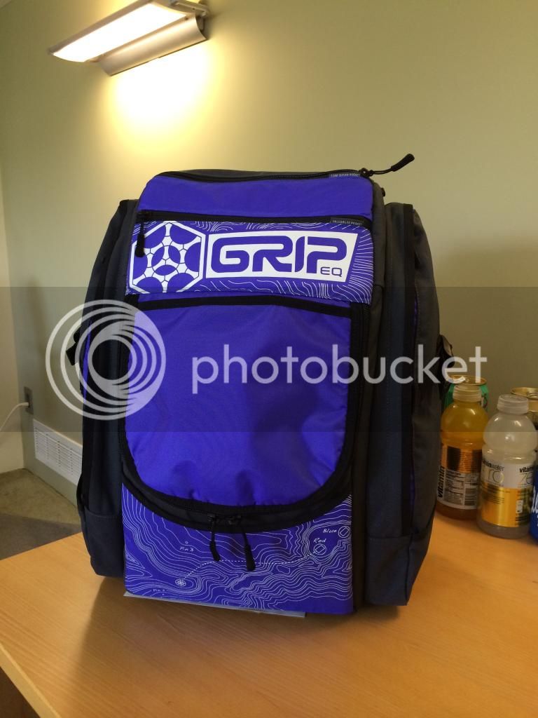
The top logo is better than the A series for sure. Still, neither looks better than the L frame did to me. Not minding the topography map graphic and wanting it are two different things.
Would you pick one with it if they offered one without? That's what I'm trying to say I guess. When I go with a bag I kind of want it to look sleek and less cluttered. I'll personalize it how I want, I don't want them screen printing some silly graphic all over the bottom. What does that add aesthetically? It adds cost. It adds more people not wanting to buy your product. I don't think I've ever bought something and thought "man this looks good but if they had just screen printed some random looking image all over it I'd be much happier"
opcorn:
It all comes down to what kind of flair you like with your bag, I guess.Just playing devil's advocate here, but isn't there a bit of patterning going on with your new Soldier bag?
I won't be buying one of these, anyway, but it wouldn't be a deal breaker personally. I actually think the labels are the worst part of the bag.
I'd buy the purple over all of them.
That's true their is a pattern to the fabric. I guess I find a difference because one is part of the material and it's done throughout in a subtle way. Maybe I would feel different about this if it was continuous of done more low key. Right now it just stands out and I see no purpose. Plus it's not part of the fabric it's an additional cost of a screen print. If they had made real changes I probably would have already preordered one despite the topography map. Thing is they are touting that as one of the changes and the rest just seem pointless. They couldn't figure out how to balance the bag in round 2 I don't have much confidence for this one. I don't need my bag parts labeled. I love my L Frame but I see no point in releasing this so close to the A frame bag and making very little changes that are worth the price.
The soldier bag won't be for everyone but at less than a 1/3 of the cost of this new grip I can store as much water, maybe 1 or 2 less discs, and I really don't gain much storage over it with my grip. I do have one and this has the same side pockets. I just think they're moving in the wrong direction personally. If you want to keep charging that price you have to make changes in the quality of the bag or reduce the costs I believe. They can't keep relying on that "first backpack design" sales pitch. There are better options coming out. This is coming from a fan of grip bags too. :thmbup:
Topography looks tacky, that is enough to put me off on the bag. Other than that it looks good to me. The labels are also kind of really dumb.
How's your Fisher price catalyst holding up?
Got rid of it after salient got rid of me. I like the bag dont get me wrong but i am much happier with my ergo2.
Jeebus that thing looks nice! I just got an all black bag last holiday season (when they were on sale for $175) but these new designs looks even better. Could get purple or teal, like my Charlotte Hornets...hmmm.
apparently staying a loyal customer really paid off, look what I just got in the mail...
...... email that is