• Discover new ways to elevate your game with the updated DGCourseReview app!
    It's entirely free and enhanced with features shaped by user feedback to ensure your best experience on the course. (App Store or Google Play)

Tee sign layout

notroman

* Ace Member *
Joined
Sep 24, 2008
Messages
4,737
Location
Highland Park, IL
Alright, so I decided for no reason at all to learn to make tee signs tonight. I made up a sign for hole 1 at one of my favorite courses, and all is well. Then I went on to make one for hole 2 and I ran into a problem.

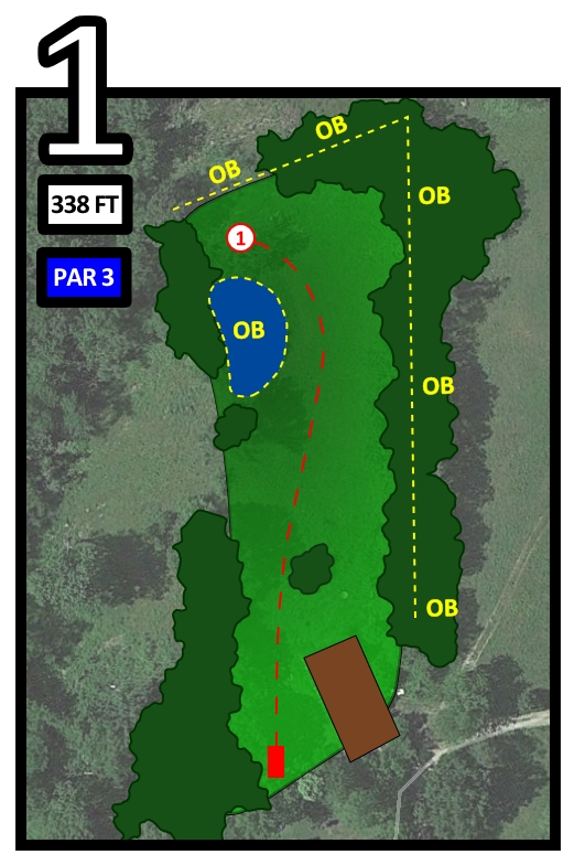
Hole 1 is just a basic straight forward par 3. Hole 2 is a tough dogleg par 4 requiring two accurate drives. There are more par 4 and par 5 holes like this on the course. So while hole 1 fits on the scorecard just fine, these other multi-fairway multi-shot holes will require more space to make everything appear as clear as it does in this first sign.

So what's the best way to handle this? Make hole 1 graphic smaller and deal with the background filler? Keep everything as is and deal with the reduced dimensions of the multi-shot holes? What would be the best compromise?

Here's the first sign I made:

GTzM7.jpg
 
Make hole two from a higher vantage point so to speak? Unless you want the uniform approach to it
 
I prefer to have everything to the same scale. If your tee signs are big enough to show the graphic for the longest hole, they will also show enough detail for the shortest hole, even if that short hole only takes up a little corner of the sign.

Or, if you want to use all the space on every sign, make all the graphics first, then inflate them after all the symbols are on. So, the short hole would have a larger tee pad symbol than the long hole. That conveys the scale, too. Not as well, I think.
 
One course I played had two pictures on each sign.
The picture on the left side was a course map. With a red ring around the hole you were currently playing.
On the right side there was a picture of the hole. Scaled so it was easy to see and read everything.
It wasn't the same scale for every hole but that didn't matter since you could always get that info by looking at the map on the left.
Also made it easy to navigate on the course.
 
I've never understood the picture of the hole on the tee sign...if you're standing near the tee, looking at the hole, why do you need a picture?
 
I've never understood the picture of the hole on the tee sign...if you're standing near the tee, looking at the hole, why do you need a picture?

Really!? You've never played a hole that you can't see the pin? Or need to know where the landing areas are, or would ike to know where the OB is, or would like to know exactly how far away it is, or...?

You need to get out more..
 
Martin...I am referring to the pic taken from the tee...showing you the same thing you are looking at as you stand there.
 
That looks pretty good (to me) as is, Roman! :thmbup:

That said, I have the graphic design acumen of a third grader. :|
 
Really!? You've never played a hole that you can't see the pin? Or need to know where the landing areas are, or would ike to know where the OB is, or would like to know exactly how far away it is, or...?

You need to get out more..

This.
 
If the tee is actually a RED tee, then fill in the Par and Distance boxes in Red as well, do the same for other tees if you have multiple sets - keep them color coded for the skill level (try to stick with the standards in the PDGA guidelines).
 
Martin...I am referring to the pic taken from the tee...showing you the same thing you are looking at as you stand there.

That's the point. On a blind pin hole the photograph should be edited to show features you can also see while standing on the box. Imagine a hole that plays up and over a ridge. The photograph can show which direction the hole finishes, or maybe even point to a specific tree and call out that it is 300' away.
 
I agree more with S. West's second phrased approach of setting the "fixed" elements on the sign template to your desire (hole number, distance and par boxes) then... Scaling the birds view graphic to maximize or fit cleanly the remaining space. Steve seemed to second guess this approach on readable scale... But I say it sounds like a good way. Still get shape, critical elements., readable - And you've supplemented hole length in the boxes.

If someone is getting that literal about scale... They're likely very detail analytical to the point where you might not ever please them anyway, or to the point where they might not see the forest for the trees, or the course for the signs.
 
Adjust the graphic for each hole. But as suggested adjust everything. You may also want to put a scale on each sign. Then someone can estimate the distance to a tree, water, bend in the fairway, etc with having to clutter the graphics with lots of distance measurements. I'd also consider using more basic graphics and not actual overhead pics. In the long run the basic graphic will be more readable as it fades.
 

Latest posts

Top