• Discover new ways to elevate your game with the updated DGCourseReview app!
    It's entirely free and enhanced with features shaped by user feedback to ensure your best experience on the course. (App Store or Google Play)

Valentine's Day Contest - How It's Made

roggenb3

* Ace Member *
Joined
Jun 9, 2013
Messages
2,990
Location
Madtown
We did a thread for Okthrowberfest - How It's Made, so here is an analogous thread for the Valentine's Day contest.

For those of you who don't know (probably most people), my entry (Eros and Thanatos) is from the Venture Brothers S4 episode "Assisted Suicide", where Eros and Thanatos are played by Billy Quizboy and Pete White and are encountered by Dr. Orpheus when he enters the mind of Dr. Venture.

1) So the first step was to get the stencil. The characters on the disc were taken from different scenes (images I found on Google). So I printed off both images, cut out the characters with an exacto, lined them up, then traced out a clean copy. (picture #1)

2) Next step was to cut out the stencil, and mark off where the disc would go. I do that by turning on the light board and placing the disc upside down on the image, so you can see the image through the disc and can line it up exactly where you want it. (picture #2)

3) Next was to weed off the black areas and do a hot dip with idye black. (picture #3)

4) Then this is where it got a bit interesting.

Rather than do the color first and then shade, it seemed easier in this case to do the shading first. I weeded off any area that would be darker shades of the reddish color that makes up most of Thanatos, and those were then filled in by painting on detergent mixes of idye silver/grey and idye gun metal. (picture #4)

5) Then I colored in all the areas on Thanatos with a detergent mix that was 10:6:4 of ProChem bright red : idye pink : idye lilac .

You can see here that I messed up and forgot to weed a piece on the part of his scarf behind his head that I had to fix later on. (picture #5)

6) Then ALL of the other colors were done as the pieces were weeded off.

The order was: Eros' skin (room temp water application of orange and red), then Thanatos' skin (room temp water application of red), then some shading on Thanatos's face and neck (gunmetal), then Eros's hair (idye orange), then Eros's eyepatch and harp (golden yellow/gun metal), then fix the part I missed in the last step.

Here you can see how bad the bleed in the center of the disc was. (picture #6)

7) Then spin on a very thin black line on the rim. (picture #7)

8) Then draw on the background design.

Random tip - don't use a sharpie for something like this. You will likely accidentally smear some sharpie onto your disc - use a pen that will not dye a disc. I used a pen that wouldn't dye, but it also wouldn't dry, so I was smearing it all over as I went. (picture #8)

9) Then just weed/dip until it's done. This was 45 min in violet for the darkest, then 45 min in crimson, then 20 min in violet, then 15 min in pink.

10) Touched up the shading on Thanatos to try to hide the bleed in the middle of the disc. This made his face look weird if you know the character, but it also hid the bleed pretty well. (picture #9)
 
Last edited:
Pictures 1-3
 

Attachments

  • erosone.jpg
    erosone.jpg
    90.9 KB · Views: 60
  • erostwo.jpg
    erostwo.jpg
    65.5 KB · Views: 52
  • erosthree.jpg
    erosthree.jpg
    84.1 KB · Views: 74
Pictures 4-6
 

Attachments

  • erosfour.jpg
    erosfour.jpg
    87.2 KB · Views: 58
  • erosfive.jpg
    erosfive.jpg
    78.4 KB · Views: 55
  • erossix.jpg
    erossix.jpg
    95.4 KB · Views: 68
Pictures 7-9
 

Attachments

  • eroseight.jpg
    eroseight.jpg
    89 KB · Views: 50
  • erosseven.jpg
    erosseven.jpg
    128.1 KB · Views: 55
  • Ero&Thanatos.jpg
    Ero&Thanatos.jpg
    150 KB · Views: 74
Thanks for sharing your process, roggen. Great job on a really cool dye. I feel like I actually put in the least amount of time/work out of the 4 entries. I didn't take any pics along the way, but mine was really just a simple matter of finding a cool image, transferring to disc and hand painting until I was (almost) satisfied with the colors.
I started with a google image search and printed out the pic to a size to fit on a disc. I traced just the very outline onto vinyl and then used that to do a dip in old formula rit fuchsia for the background color. Next I unmasked the image area and traced the major image elements onto the disc using carbon paper. I then mixed up a super light color somewhere between pink and 'fleshtone' and used that to trace the carbon lines. Then wash off the carbon from the disc leaving a faint outline to work with. From there it was just a 'simple' matter of mixing idye powders with acetone in varying strengths and shades and painting using mostly paintbrushes, qtips, and cotton balls. Having an art background and experience with watercolor painting also comes in handy. ;)
 
8) Then draw on the background design.

Random tip - don't use a sharpie for something like this. You will likely accidentally smear some sharpie onto your disc - use a pen that will not dye a disc. I used a pen that wouldn't dye, but it also wouldn't dry, so I was smearing it all over as I went. (picture #8)

9) Then just weed/dip until it's done. This was 45 min in violet for the darkest, then 45 min in crimson, then 20 min in violet, then 15 min in pink.

I'm confused on what you did after marking off the background design, did you mask over the previously dyed portraits before dipping?

Overall, a great dye. Thanks for writing up the steps, it really helps show the level of planning and artistry behind the masterpieces you guys produce.

:clap::clap::clap:
 
Yeah man...thanks for sharing this. It's pretty cool to see the step-bystep photos. I voted for DTP, but you were definitely a close 2nd.
 
I was flawed by your entry, and even more so to know how much work this took. Phenomenal!
 
I'm confused on what you did after marking off the background design, did you mask over the previously dyed portraits before dipping?

Yup. Once the characters were done I remasked, then cut the outline of both characters on the disc, then drew on the background and cut that.
 
Oh looking closer, I can see you must have used almost a clear vinyl to remask it. Very cool.
 
1. Came up with a silly idea about the duration of Taylor Swift's relationships & searched for a perfect image.
picture.php

2. Spend hours and hours using Windows Paint to get the image to 3 shades of graytone.
3. Spend a couple more hours converting it to a cut-able vector, then making adjustments to the vector so it would cut properly after mutliple failed cuts (I used a plotter).
4. Make a good cut.
5. Weeded just the lettering and applied the stencil to the disc (star Gator)
6. Dyed the lettering in a warm red dye bath ~10min & then re-masked the lettering with vinyl.
7. Weeded and hand dyed the black bracelets.
8. Weeded and hand dyed the blue portion of the bracelet. Then re-masked the blue portion.
9. Weeded the darkest gray of Ms. Swift and dyed in a warm bath ~8min
10. Weeded the medium gray and dyed in a bath ~1min
11. Weeded the light gray and dyed in a bath ~30seconds.
picture.php

12. Masked off Taylor with vinyl
13. Did a reverse shaving cream method for the background.
14. Cut the "2 weeks" stencil, applied, and hand dyed it over the 'EVER' (ever, getting back.... )
15. REPEAT steps 4-14 until it turns out good enough (3 times).
picture.php
 
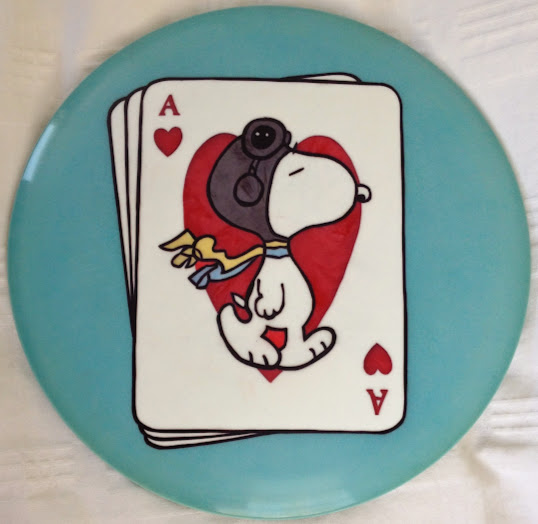
I had intended to take some pictures along the way, but I got going and forgot about it. Anyway, here is the step-by-step for Snoopy:

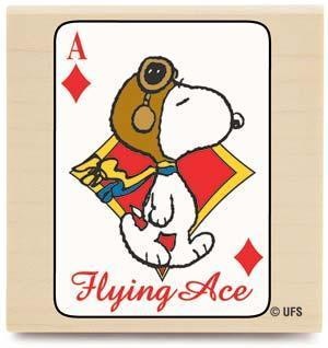
1. I found an image of Snoopy on a card. I changed the diamonds to hearts, added the A's in the corners, and drew in the edges for the other cards in the background.

1f87a4a5712b72bfcd4b31d6f1473e51.jpg


2. I used transfer paper to trace the image onto vinyl. Then I went back over the carbon lines with a ballpoint pen so they didn't smear while I was cutting, and to make the lines more precise.

3. I cut out all the lines on the vinyl and transfered the vinyl to the disc.

4. Weeded and dipped the black sections with iDye Poly Black.

5. Weeded and dipped the red sections with iDye Poly Red.

6. Hand-painted the other colors by mixing hand lotion and iDye Poly Brown, Turqouise + Blue Mix, and Yellow + Red mix. I usually work from darker colors to lighter colors.

7. I peeled off all of the background vinyl, then cut a small sheet of vinyl to go over the cards. I actually just left the vinyl on that was already over the cards. I thought it might be easier to trace the edges that way. I also masked off the back of the flight plate. I should have masked off the back earlier as I got a few dye smudges on the back from the painting step, nothing that shows through to the front though.

8. I dipped the back of the disc in iDye Poly Turqouise to dye the back of the rim.

20150218_073819.jpg


9. Then I flipped the disc over and dyed the front of the disc with Turqouise. I thought about adding some cloud design in the background, but I couldn't come up with an idea that I really liked, and I thought a simpler background might look better anyway.

10. Then I peeled all of the vinyl off. I should have been done at this point, but I found that I missed two red sections back in step 5, between Snoopy's legs and between the scarves. I went back and hand-painted those sections, but I had to let the dye sit for a long time to get the colors to come close to matching. If you look closely, you can see that those two sections are just a little lighter than the other red sections.

snoopy_ace.jpg
 
2. Spend hours and hours using Windows Paint to get the image to 3 shades of graytone.

I'd love to know how you did this. Any specific Paint tips/tricks you can share? I can't tell you the amount of time I have spent looking for multi-layer stencils, it would be awesome to just be able to create my own.
 
I'd love to know how you did this. Any specific Paint tips/tricks you can share? I can't tell you the amount of time I have spent looking for multi-layer stencils, it would be awesome to just be able to create my own.

Best I can tell you is to use good software(Photoshop/ Illustrator are excellent) and mess around, a LOT. use different levels of layers for either, adjust levels of grayscale/ black-white, filters like Cutout or Posterize, etc.
 
Bennet is right: use good software... but I don't, so it takes me much longer. I use Microsoft Office 'Edit Pictures' to "high contrast" and sometimes "grayscale" my image, then I use an older version of paint to convert to 16 color bitmap. I once had "despeckle" on a program at work that worked awesome. Then comes the hard part of using bitmaps: combining or bridging same-color parts and eliminating single bits so that my cutting software can convert it to a cut (hard to explain).
 
Bennet is right: use good software... but I don't, so it takes me much longer. I use Microsoft Office 'Edit Pictures' to "high contrast" and sometimes "grayscale" my image, then I use an older version of paint to convert to 16 color bitmap. I once had "despeckle" on a program at work that worked awesome. Then comes the hard part of using bitmaps: combining or bridging same-color parts and eliminating single bits so that my cutting software can convert it to a cut (hard to explain).

SO. MUCH. THISSSSS.

This is one of the most challenging parts of owning a plotter. What looks like a cut-able image is suddenly cut over cut over the same cut, and to eliminate all the double-cutting takes time, patience, and a little bit of luck.

In Illustrator or other similar vector-based programs, it's quite easy to create the LOOK of your design; it's a whole 'nother can of worms entirely to get it prepped to cut without overlapping or cutting into the design itself.
 
This confirms my belief that im better off just continuing to handcut. Sounds painful, especially for someone who is not a computer person.

But it sounds like worst part is getting it cutable, and I only need it to look good, then I'll just print and trace. I'll see if I can figure it out.
 
Bennet is right: use good software... but I don't, so it takes me much longer. I use Microsoft Office 'Edit Pictures' to "high contrast" and sometimes "grayscale" my image, then I use an older version of paint to convert to 16 color bitmap. I once had "despeckle" on a program at work that worked awesome. Then comes the hard part of using bitmaps: combining or bridging same-color parts and eliminating single bits so that my cutting software can convert it to a cut (hard to explain).

Have you looked at GIMP? It's free and quite capable.
 
Have you looked at GIMP? It's free and quite capable.

Gimp is really good and worthwhile to learn...

Of course, I am a MS Paint guy myself and only go to Gimp when it can't be done on Paint...

...but I digress... Gimp is free and powerful
 
Top