• Discover new ways to elevate your game with the updated DGCourseReview app!
    It's entirely free and enhanced with features shaped by user feedback to ensure your best experience on the course. (App Store or Google Play)

Your FAVE Course Signage???

Of course I'm a fanboy of my home course but Ventura_Tom did an amazing job with our signs. I really like that they have a P.O.V. photo of the holes and trajectory arrows.

I've never seen signs like that, I have to say that is a great idea, I really like those.

At Idlewild...we recently replaced all our tee signs with these: http://www.houckdesign.com/platinum_tee_signs.html

They look very good in person with large sponsor boxes as well.

It's been a while since I've played Idlewild, I need to make it back up that way soon. Like the signs on the link, I bet those look great on the course!
 
Haha, easy killer. Most good courses will place their signs at the back of the tee box or even further back (like the CMC course I mentioned above).

I do agree that having something in your throwing line or peripheral vision could be distracting but I've yet to run into that.
i think some of where im coming from is a regional thing we have almost all natural teeboxes here so quite a few courses the tee sign marks the end of the tee so it has to be in the front .
 
I went out and finally took some at Alexander Park:

493f2576.jpg

b61570ec.jpg

18e2c647.jpg


And where they are in relation to tee:
99dd46e5.jpg


Oh man! I didn't even see that can there or I would've grabbed it...If you left it you are a douche!
 
tee signs near the end of the tee are trouble..people will complain about them being in view when throwing...but for me, i hate worrying about smacking my hand on one like i did in carloina at ecu..hard when you have a 7 ft wing span
 
sawweet... I havent played there in a couple of years, going to get my fix this weekend though, you're too lucky to live that close..

I love the Idlewild signs....

You actually have a real view of the hole not the normal cartoony BS
 
The GREAT thing about the Idlewild signs that nobody knows...except after I tell you...everyone will know is....Houck did the graphics for us...but we ourselves printed the signs in the Boone County sign department. We printed them on the same reflective metallic material that stop signs are printed on and attached this sticky back metallic foil to stock sign material. Now...if some smuck damages one of our signs we can go to the sign department and print and create a new teesign. We also anchored the plexiglass to the sign using security bolts that require two specialty tools...one on top and one on bottom to remove the bolts.

Certain hole sponsors paid extra to have a copy of their tee sign sent to them. On some of these we printed on a glossy vinyl material used for banners..this makes an excellent material to frame and put on the wall.
 
It is near the back...you are looking towards the basket.

I think they are kind of backwards but they are pretty enormous and level so it doesn't matter as much.

You can see the red tee ahead, it is a normal shoebox design.
 
I don't think signs have to be visually exacting as long as they capture the most important features of a hole. The cartoony look is great if it works; hand painted signs work... but I think the features that need to be on any great sign are:
  • Hole number -- make it large and high contrast so it can be seen from a distance
  • Distance -- If there are multiple tees or pins, list the distance for each combination
  • Map of the hole -- show where the major trees are, bodies of water, any OB, any other distinguishing marks, and show with an arrow the most common line(s) to the basket.
  • Directions to the next tee -- show someone how to get to the next teebox. If there are special conditions -- like a long walk -- include those on the sign. Nothing worse than finishing a hole and having no idea where to go.
  • If the pin moves into different positions, the sign should be designed to indicate the current pin position. Lots of ways to do this, but it is - IMHO - essential to any good signage that you know where to go. Not just what three places you MIGHT have to go. I want to know where to throw THIS ROUND without walking up the fairway to look.
  • For courses with multiple tees -- clearly have the signage mark WHICH tee you are on, and WHERE the other tees are relative to where you are standing. Ideally, each Teebox should have its own teesigns -- not just one set of teeboxes. Teesigns for all teeboxes.
  • Sign placement -- signs should be behind and off to the side of any teepad. I'd say place all signs at least 5' away from the side and 10' from the back of any teepad. Many people start their runnup before the teebox, and it's nice not to have the sign in the way. Placing the tee back also allows other players on the card to study the hole and think about what they want to do when it is their turn -- in theory, this should increase speed of play.
  • Durable/Fadeproof. Make signs as long-lasting as possible. Also, if they can be designed so they blend into the landscape, that's even better. Make the course feel as natural as possible.
  • Redundancy -- as a final note, in areas prone to vandalism, it is great if the teebox itself can reinforce the main points of the sign. At least the hole number should be permanently placed on the teepad somehow (9red) or whatever. If possible, a simple arrow showing the general direction of the hole and the distance is even better. This means that in the event of a lost sign, people can still find their way around the course.
  • Finally, don't forget that Maps should work hand-in-hand with signage. Pin markings should also work. There are lots of ways to direct players to the next hole from the pin -- use one or more of these methods. People don't always remember to look at the signs for next hole information, so including it on/around the basket as well does wonders in aiding navigation. Do everything you can to make your course easy to navigate. It's a sign of care and professionalism.
 
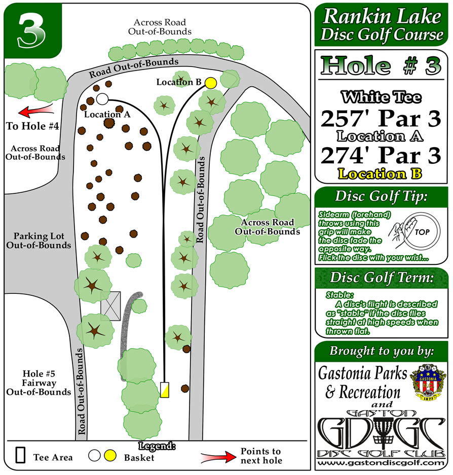
You know what, I am surprised that Rankin Lake hasn't been brought up yet, they only have these signs on the front 9 but they are amazing. I did not really read them when I played but I was thinking about them and started really looking and wow, tips and tricks...pretty cool:
layouthole3.jpg


Website with signs and pics of front 9:
http://www.gastondiscgolf.com/club/Courses/tabid/56/Default.aspx
 
My favorites were at Tyler state park. They have accurate pictures showing the placement of the multiple tees and in some cases multiple pads. Along with the basic obstacles in the way. They were easy to understand and gave good directions. The best part that really set them apart was the way they had set up a dial to tell you which tee the basket was on. I have been on courses when you have no idea which one to use because there is no marker and you cannot see it. Nice job to the club at Tyler!
http://www.dgcoursereview.com/gallery.php?id=29&mode=gal#

The picture does not do it justice.
 
The tee signs at Idlewild are spectacular. After the first time around any course, who needs them?
 
You know what, I am surprised that Rankin Lake hasn't been brought up yet, they only have these signs on the front 9 but they are amazing. I did not really read them when I played but I was thinking about them and started really looking and wow, tips and tricks...pretty cool:
layouthole3.jpg


Website with signs and pics of front 9:
http://www.gastondiscgolf.com/club/Courses/tabid/56/Default.aspx

those are very similar to the ones at pyramids, which have them seperate for each basket (discatcher and mach v).
 
buckhorn has nice signs, as does cedar hills

two courses that I love and don't have any signage at all are cedarrock and wellsprings in burlington, amazing
 

Latest posts

Top