Skyiron Discs
Newbie
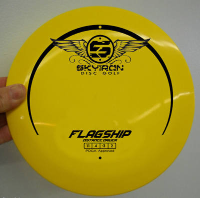
Hello DGCR Community! For those that don't know me (I'm still new) I own/operate 'Skyiron Discs' and we currently manufacture one distance driver called Flagship. Just search Skyiron or Flagship on this forum and you will see plenty of positive reviews about the plastic and flight of the disc. You will also find equally as many posts personally attacking me for my poor art choices!
My bad Disc Golf Community... I severely underestimated the importance of aesthetics. I spent way too much time making a plastic blend and well-flying disc and not enough time worrying about the stamp. This is where you come in. Run 1 is sold out; I've taken all of your constructive criticism and have been making adjustments accordingly. There will be more information about the changes in run 2 later; this post is only about the art.
Two awesome DGCR community members, Les White and Josheph Sova, designed some new disc art for me! I like them both, and can print both, but I want to hear what you guys (my current and potential customers) have to say.
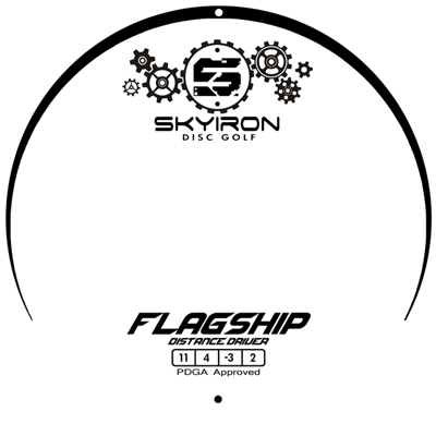
Credit: Les White
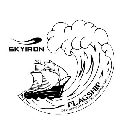
Credit: Joseph Sova
 opcorn:opcorn:
My bad Disc Golf Community... I severely underestimated the importance of aesthetics. I spent way too much time making a plastic blend and well-flying disc and not enough time worrying about the stamp. This is where you come in. Run 1 is sold out; I've taken all of your constructive criticism and have been making adjustments accordingly. There will be more information about the changes in run 2 later; this post is only about the art.
Two awesome DGCR community members, Les White and Josheph Sova, designed some new disc art for me! I like them both, and can print both, but I want to hear what you guys (my current and potential customers) have to say.
Credit: Les White
Credit: Joseph Sova
opcorn:opcorn:
Last edited: