jrawk
* Ace Member *
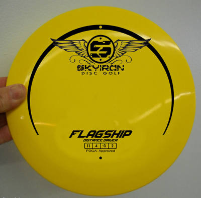
i like that design jrawk but it feels like something is missing in the middle..
beautiful looking plastic
")
Discover new ways to elevate your game with the updated DGCourseReview app!
It's entirely free and enhanced with features shaped by user feedback to ensure your best experience on the course. (App Store or Google Play)