• Discover new ways to elevate your game with the updated DGCourseReview app!
    It's entirely free and enhanced with features shaped by user feedback to ensure your best experience on the course. (App Store or Google Play)

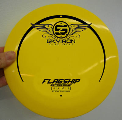
Skyiron Flagship - Run2, Art

go with either of these pinups i drew. simple, eye catching and habit forming...

vamp201.jpg

wb1.jpg
 
A few notes from the OP. I appreciate the constructive responses. The gears idea came from my engineering background + Skyiron name. The wings seem very popular but I'm hesitant to use them as a logo because a few other DG companies use that idea.

Answers to other questions, I probably won't work on developing another plastic blend until I do a putter. I'd like to get a midrange and a putter out before the spring but I'm in no hurry. Trying to make the correct business decisions for the long run because this is something I truly enjoy doing. Skyiron work is a great relief from the 8-5 grind.

Keep the responses and new ideas coming they are awesome.
 
Yeah dude just go with the wings by Aothiom, I see the wings idea EVERYWHERE in the graphics world, but it fits the company name and disc well. I would just like to add that Zeppelin would be a very sweet name for a putter if you did decide to make a mold in the near future.
 
I think this one's a winner. I vectorized the ship I drew - you can't tell from this pic, but it looks a lot more crisp with sharp edges and points. Maybe make the circle around the "S" a gear, and there you go!

Wing Disc Comp copy.jpg
 
Wow that's a lot of artwork on a disc, too much imo. I like the original wings idea or the original gears idea and leave it at that.
 
I think this one's a winner. I vectorized the ship I drew - you can't tell from this pic, but it looks a lot more crisp with sharp edges and points. Maybe make the circle around the "S" a gear, and there you go!
View attachment 16337

Yeah I like this one and I like the idea of the circle around the S being a Gear or a Bolt.

I'd actually change the font used for "flagship" since that looks a bit too much like the Innova font for their disc names to me.

One other option with this: Put the ship up a bit more towards the middle with a simple water line. And then move the Skyiron wing logo to the bottom to make the illusion of a full circle with the new moon shape. Also maybe consider making the ship a little bigger and the Skyiron logo a little smaller. The disc is the Flagship so that should be what is emphasized.

In any case, I think there is a lot of very attractive artwork here as options. And kudos to Skyiron for listening to the constructive criticism and taking action. Very well done, sir!
 
Any thoughts on leaving the ratings (11 4 -3 2) and "distance driver" off?

Might just be a personal preference of mine but I never really like them on a disc stamp, a sticker sure but after you buy it and throw it a few times, you know what it'll do for you. Seems without those things it opens up space for other art, possibly the ship.
 
The gears were my idea, Les was kind enough to put them together for me. This is Les' original logo/disc redesign which was posted in another thread. I should have posted this one up top as well.

I apologize I don't have this art in the same format so try not to let the disc and color throw you off.
mHLZs.jpg
I think this is great.


Steampunk discs would be siiiiiick!
 
The ship art is cool.
 
Now that I think about it, it couldn't hurt to maybe make the skyiron logo a bit smaller. I think the placement of everything is fine though.
 
Top