Frolf4mylyfe.
-
Discover new ways to elevate your game with the updated DGCourseReview app!
It's entirely free and enhanced with features shaped by user feedback to ensure your best experience on the course. (App Store or Google Play)
You are using an out of date browser. It may not display this or other websites correctly.
You should upgrade or use an alternative browser.
You should upgrade or use an alternative browser.
Professionalism in discs
- Thread starter ViolaBouquet
- Start date
ViolaBouquet
Eagle Member
Well, this went off the rails a little bit. A few people pointed out about how old school Discraft discs had a small logo at 12 and 6, or how Vibram discs are, or even Lat64. I understand having a name to help identify it like cars and how that can help with the sale. I guess I should have talked more about the disc stamp than the name itself.
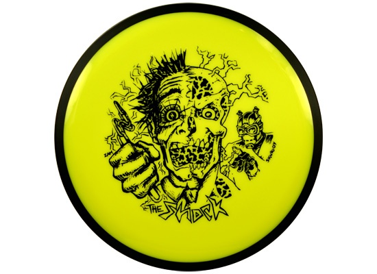
Maybe in the long run I just see stuff like this horrendous
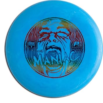
and would like to see more like this
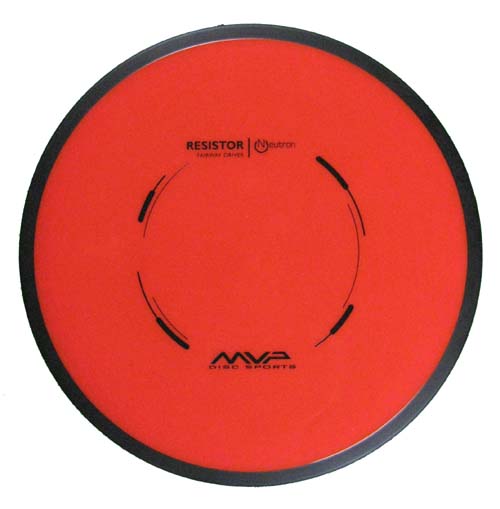
It is completely unnecessary and in no way makes the discs better or worse. Maybe it is just my OCD about things being more structured
Maybe in the long run I just see stuff like this horrendous
and would like to see more like this
It is completely unnecessary and in no way makes the discs better or worse. Maybe it is just my OCD about things being more structured
DinosaurThunder
Double Eagle Member
- Joined
- Jul 31, 2013
- Messages
- 1,395
^^^ discmania has switched to a new "sport stamp" to get people like you. They recognized a market for the artsy stamps and sports stamps.
ZAMson
^Has PhD in Disc-Artistry
Now that's just pure talent. So much motion with so few lines. Certainly a brilliant subtlety and modesty at work here.and would like to see more like this
It is completely unnecessary and in no way makes the discs better or worse. Maybe it is just my OCD about things being more structured
Well said!DG is fun
Most of the disc names are fun
This isn't a problem for the sport/game
Names are easier to remember for many than letter/number combos. As long as the names aren't stupid like Scott Stokely's crap or Vibram's 420 I don't think they're hurting much. Even then, we're a niche sport and nobody is paying attention.
Warrior lacrosse had a grip treatment for their sticks called "Nipple Grip" at one point in time. They brought it over to their hockey line when they jumped into that market and I remember being absolutely appalled. Years later almost no-one remembers or cares.
As long as none of the manufacturers are foolish enough to use a racial slur or something else that's almost universally offensive for a disc name I'm sure we'll continue to fly below the radar just the way we are now.
dsross
Newbie
I have no problem with any of the discs, their stamps or their names.
I do worry about assorted beer cans and trash that started appearing in our city park when the disc golf course was put in this summer. We pick up as much as we can, but I can see folks around town saying "those damn frisbee throwers are out there just getting drunk and leaving trash all over.".
I do worry about assorted beer cans and trash that started appearing in our city park when the disc golf course was put in this summer. We pick up as much as we can, but I can see folks around town saying "those damn frisbee throwers are out there just getting drunk and leaving trash all over.".
I have no problem with any of the discs, their stamps or their names.
I do worry about assorted beer cans and trash that started appearing in our city park when the disc golf course was put in this summer. We pick up as much as we can, but I can see folks around town saying "those damn frisbee throwers are out there just getting drunk and leaving trash all over.".
No ****, right?
We had a work day yesterday at our local course yesterday. A group of us, including my daughter, spend a couple hours picking up trash. We got done around mid-afternoon yesterday. By the time we showed up for league at 10:00 a.m. today, there was already numerous bottles, cans and cigarette butts strewn everywhere.
So yeah, DG has bigger problems.
But the name thing...I hear people trying to explain stability and glide and stuff of discs to new players, and said new players always come back to "how does it fly like a Destroyer" or a Buzzz or a Truth or a Scythe or whatever. Never a Prodigy disc. Never caring about actual flight numbers/chareteristics, what have you. So those names stick, man.
Of course there's room for more "pro type" names for plastics and discs, too. As others have said, Discmania has a pretty good model. Clean shield stamps and simple letter names, but also having big flashy stamps and wacky names.
That is sort of ironic, because for most new players, ever disc flies like every other disc, unless it is extremely overstable, or a roadrunner.
Well, this went off the rails a little bit. A few people pointed out about how old school Discraft discs had a small logo at 12 and 6, or how Vibram discs are, or even Lat64. I understand having a name to help identify it like cars and how that can help with the sale. I guess I should have talked more about the disc stamp than the name itself.
Maybe in the long run I just see stuff like this horrendous
and would like to see more like this
It is completely unnecessary and in no way makes the discs better or worse. Maybe it is just my OCD about things being more structured
So you're a qualified Art Critic now?
You do realize that artwork is sort of subjective right?
Some people might prefer the edgy versus the simple.
Maybe, just maybe, a new-to-the-sport player might be more inclined to pick up the former rather than the latter because of the artwork.
Isn't that #growingthesport?
runningDoc
Double Eagle Member
- Joined
- May 21, 2014
- Messages
- 1,605
new P1 has this stamp.

ViolaBouquet
Eagle Member
So you're a qualified Art Critic now?
You do realize that artwork is sort of subjective right?
Some people might prefer the edgy versus the simple.
Maybe, just maybe, a new-to-the-sport player might be more inclined to pick up the former rather than the latter because of the artwork.
Isn't that #growingthesport?
Yes
Yes
True
True
Not Really
That is sort of ironic, because for most new players, ever disc flies like every other disc, unless it is extremely overstable, or a roadrunner.
That's a broad generalization that I have found to be very untrue. It's sort of like the "only throw putters for x amount of time" myth...it's perpetuated by players who are only slightly above average and whom also look down upon new players, for whatever reason.
As a relatively new disc golf player (~3yrs) I find this argument/conversation interesting.
For me, walking into the sport with only a 4 disc Discraft Starter pack, the inconsistencies of disc characteristics (including names) was a daunting mountain of spaghetti to make sense and order of.:doh:
My issue was my comparative reference: golf.
See, I have a fairly standard set of golf clubs. Drivers/Woods: 1, 3, 5, 7. Fairway/Irons: 3, 4, 5, 6, 7, 8, 9. Wedges: Sand, Pitching. Putter: simple blade putter.
The thing is, I can hate any one of my clubs by any particular manufacturer. I can go to the Pro Shop and ask to see, for example, their selection of 9 Irons and BOOM! No confusion. :thmbup: (We could get picky with loft and lie angles, among other club related metrics, but I believe the point is made.)
This is where disc golf is weak, in my opinion: We have no mutually accepted, general classification system (and no one company has presented a complete alternative/solution):thmbdown:
I would personally prefer a hybrid of Prodigy/Discmania type designation combined with a finer grained Innova/Discraft flight characterization. Names and flight paths descriptors could simply be icing on the cake.
For example, a putter, the MVP Anode:
By Innova terms (infinitediscs.com)
Speed: 3
Glide: 3
Turn: 0
Fade 0
In my mind a: P-3
P - Putter
3 - It's Cruising Velocity target ( on a 1 - X scale where numeric "bins" are defined in terms of discrete meter/second or mph bounds)
As such it's full name might be: MVP P-3 Anode (the best of both worlds)
Glide, Turn, and Fade designations would serve to distinguish the disc among other P-3 putters.
Personally, I would like to see Glide on a 0-10 scale where bins are respective of % hang time, Turn on a -10-0 scale, and Fade on a 0-10 scale.
Ultimately the Anode might be fully defined as:
MVP P-3 Anode [3,-1,1]
Similarly, the Aviar Classic:
Innova P-2 Aviar Classic [2,0,0]
All said, I admit to being obsessive about this topic to the point where I have begun statistically analyzing the 600+ discs on inboundsdiscgolf.com flight path database in reference to various Innova interpretations. I hope to be able to prove, mathematically, that the concepts I have described above are already in practice through common understanding but are as of yet undefined by common, public practice.
However, let us not forget the intended purpose of such systems (and why manufacturers are against them). The point is to improve quality standards for our beloved game and for the equipment we use to play it, from manufacturer down to the green.
- Joined
- May 3, 2010
- Messages
- 3,791
I think the car analogy is the best. A Camry is like an Accord is like a Taurus is like an etc etc etc.
What really sets these cars apart? Tiny details like trunk space, head room, feel, look. You won't REALLY know what it's like to drive until you get behind the wheel. Same thing with a new disc. It's like a roc is like a wasp is like an etc etc etc.
I never hear new automobile drivers complaining about car names being too confusing, how is it any worse with discs? That's why there are flight charts.
I think the car analogy is the best. A Camry is like an Accord is like a Taurus is like an etc etc etc.
That's all fine and good, and your point regarding wide categorizations and personal interpretations did not go unnoticed. However, I don't know many people who have 10 or more cars in their garage to bring out and drive where conditions are appropriate. Nor do I know of anyone who might start a drive with one car, then change out cars are they approach their destination.
Maybe a car-less commuter, who takes a bus, then rides a bike, then walks the final steps to say, the Post Office, would be the more apt appreciation. Here we could classify transportation methods as we commonly do. Bus: High Speed, Low Precision. Bike, mid speed, mid precision. Feet, low speed, high precision?
Yet, doesn't a charter bus differ greatly from a Bluebird School Bus?
How does "compact car = compact car" compare to "bus = bus" ?
I think we can all agree that there is room for improvement and, in reference to the OP, standardization is a first step toward professionalism.
So you're a qualified Art Critic now?
You do realize that artwork is sort of subjective right?
Some people might prefer the edgy versus the simple.
Maybe, just maybe, a new-to-the-sport player might be more inclined to pick up the former rather than the latter because of the artwork.
Isn't that #growingthesport?
troof! sometimes I go both ways . . . . . :|

- Joined
- May 3, 2010
- Messages
- 3,791
I think we can all agree that there is room for improvement and, in reference to the OP, standardization is a first step toward professionalism.
Mmmm nope, I don't agree. Standardization is a first step toward banality and ennui.
i dont mind this at all nor do I think its unprofessional. Car companies do the exact same thing as so golf companies mentioned above. Its purely marketing. I do like Westside, MVP, DD, and the other companies whos idea is to have a theme in their names. Companies like Innova or Discraft that dont really have a theme, it still works for them and their discs sell. I cant remember a flight rating for a beast, boss, sidewinder, teebird, hatchet, escape, saint, amp... way easier than I can a p2, m2, m3, m5, f3, f5, f7, d1, d3 etc
Similar threads
- Replies
- 2
- Views
- 498