• Discover new ways to elevate your game with the updated DGCourseReview app!
    It's entirely free and enhanced with features shaped by user feedback to ensure your best experience on the course. (App Store or Google Play)

[Vs.] Most Professional Looking Discs/Stamps

Most Professional Stamp?


  • Total voters
    155

Brodysseus

* Ace Member *
Joined
Sep 21, 2012
Messages
2,526
Location
IL
Which company (or specific plastic line from a company) has the most professional looking stamps, in your opinion?

I personally think Discmania's C-Line, Gateway's HPP, and (as much I HATE to say this) MVP's Proton/Neutron.
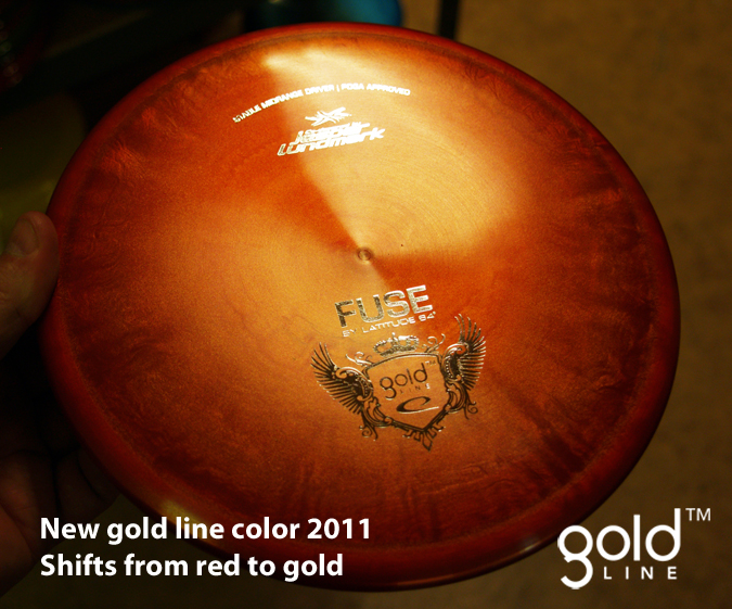
 
Lat 64 Gold Line

716.Fuse_gold.jpg
 
Define professional...

However you define it.

What I was thinking though was a stamp/disc design that makes a disc look like a piece of legit sporting equipment.

But vote for whatever looks "professional" to you, however you choose to define it.

Edit: For example, I love my Vibrams and how they look. But the random multicolored designs look more like something a hippie would enjoy, not a professional/athlete, so for my definition; even though they look cool, Vibrams don't look professional.
 
Last edited:
What is professional? ones that don't look like a child's Frisbee?

I care more about how the company presents itself to the community(customers, retailers, etc) than what stamp they put on a disc. Most companies that do things the right way tend to keep their stamps clean and simple anyways
 
However you define it.

There are multiple ways to define professional:

1. Most simplistic: Vibram. I get your point about the multi colored plastics, but the question was just about the stamp. It's hard to get more simple than a small company logo on the flightplate.

2. Most artistic: Skullboy stamps are the most professional looking artwork in a stamp.

3. Most elegant (I think this is probably the intended interpretation): Probably Latitude Gold Line or Innova Star
 
MVP neutron stamps and Lat Gold Line are some of the cleanest.

Westside is my current stock stamp favorite.

I also really enjoy Skullboys stuff.
 
Prodigy keeps it simple and elegant, no fancy artwork. not very exciting but very professional looking.
 
I think Legacy's discs look very professional. There isn't a lot going on with them. They are simple with just the company name and disc name. I also think that the website on the front of the discs is a good marketing move.
 
Honestly, I like no stamps, just a clean disc with a bottom or rim stamp.
 
I'm really surprised latitude isn't running away with this already. The gold line is top notch, small unobtrusive with the name of the disc.
 
Gonna have to vote Westside.

Stamps are the same across all plastics. They stuck to the same theme and you can tell they use one artist for everything.

No other company will make a stamp with a duck and an egg look so good.

Also:
Swans and skulls
 

Latest posts

Top