XCyclone
Double Eagle Member
Someone's gotta throw a Blue Moon beer logo on one of these things:

Discover new ways to elevate your game with the updated DGCourseReview app!
It's entirely free and enhanced with features shaped by user feedback to ensure your best experience on the course. (App Store or Google Play)
I recognize that picture, so it was you who friended me on Facebook. I was wondering who that was. =)dgdave said:I love the black nose with a black dye. It's a nice frame

Worm 28 said:My Apologies.. I had them check on those oranges... I thought that they were ran on the last end of our big Soft run... however they were ran during the beginning of the Medium proto run. I will however try to see if we can run some more of those oranges when we get our big Medium run going and will be sure to take lots of pictures of some of the new colors we will be trying to runYehosha said:Awesome thanks.Worm 28 said:Yehosha said:I remember reading somewhere that there will be a new shade of Orange, that actually looks bright orange and not the pale fleshy orange out now. Any chance of getting a pic of one of these discs posted when they are made?
Yep! I believe they were ran on the later portion of our second run, which were Softs. I will see if we still have some of them around and if I can get a picture taken for you.
Thanks,
~Chad
Thanks,
~Chad
Pat said:Does the tooling on the bottom of this disc bother anyone?
Is that a red disc in weird lighting or is it one of the medium oranges? I'd love to get a soft in that color.dgdave said:Here's one I just pulled out
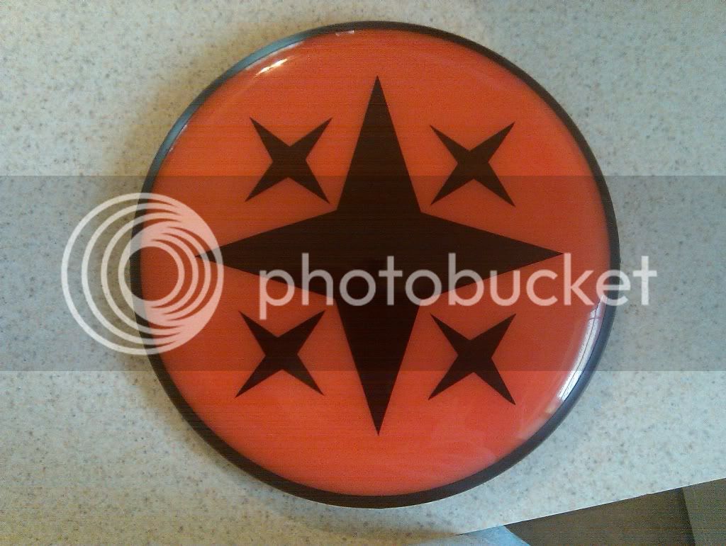
Yehosha said:Is that a red disc in weird lighting or is it one of the medium oranges? I'd love to get a soft in that color.
hmm maybe I'll try and trade for one of those then.dgdave said:It's a very orangey red.
marmoset said:When I saw 2 of the entries for the art contest I thought of this local company's logo:


Frank Delicious said:Mike is a good guy and wouldn't knowingly rip off a design.
it's more like two strangers creating a 90% identical mad-lib. sure there is a structure and parameters that would further a similar path of decisions, but it's unlikely, and difficult to believe without more data. my suspicion arose from the use of 3 unique and incongruent methods of symbolizing the rings which appear in both logos. i can read this stuff like a language, and you've got two different people following the same path, making the same decisions through several highly variable points. i'd say it's like a 1-in-1000 level of coincidence to find this kind of similarity in design choices. that's a real number... i bet if you found 1000 similarly-styled atom logos, i'd only find 1 that was actually fishy.discspeed said:Saying that logo is a ripoff is like saying a rock band copied another for using the same chord progression.
") )
)no, in fact this contest reaffirmed everything i think about design contests. i predicted beforehand (before i saw any submissions) that i would lose the vote with the company's preferred design. there is more to branding and product decoration than the general public is aware of.. that's why graphic design and brand identity are professions. contests play to hobbyists. luckily for MVP a boatload of Ions is quite a carrot and they baited some pros... :lol:discspeed said:Maybe Zach will feel a little better about art contests now...
Leopard said:there are endless possibilities for branding here... i can see MVP having one enviably damn-sexy product line 8)
Mike is a cool guy, I played with him on my second card at the Azalea fest. Thanks for letting me fondle that VP Mike!Frank Delicious said:Mike is a good guy and wouldn't knowingly rip off a design.
BrotherDave said:Mike is a cool guy, I played with him on my second card at the Azalea fest. Thanks for letting me fondle that VP Mike!Frank Delicious said:Mike is a good guy and wouldn't knowingly rip off a design.
BrotherDave

